- Подробности
- Категория: Uncategorised
Для тех, кто хочет поддержать нас финансами либо организационно, выполняя определённую работу, мы даём координаты для связи:
8(915) 397-2553
Все остальные вопросы разрешаются на страницах Форума.
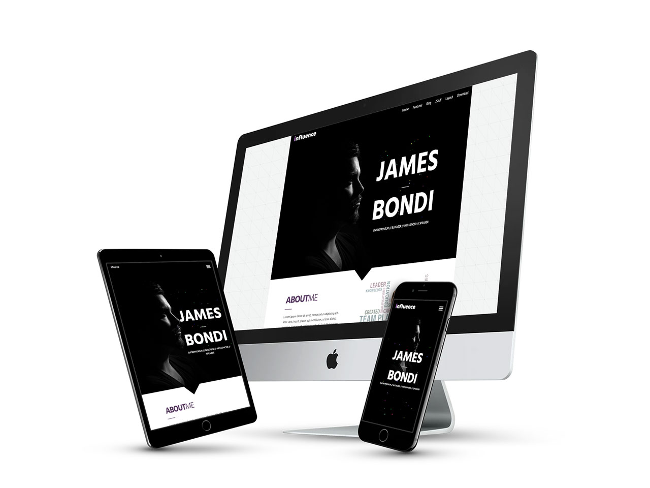
INFLUENCE
A Premium Joomla 3 Template
Influence is the perfect personal page web template for Joomla! Designed for conference speakers, artists, DJs, musicians, trainers, coaches, designers, and more, Influence will grab your users attention and win the over with its clean, fast loading structured layout and subtle effects.
The template was built with the latest JoomlaXTC Framework with total control over your site's look & feel—from Width, Layout,s Backgrounds, Font Colors / Sizes / Typesets and Responsive Control. The XTC framework allows quick and easy styling without the need to edit one line of code!
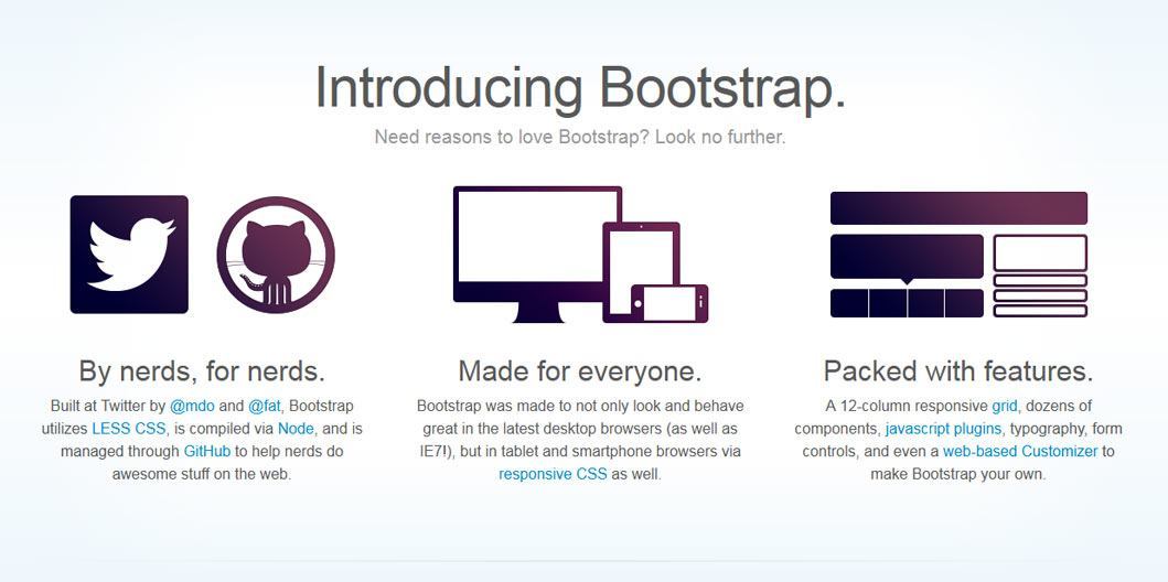
XTC Framework 4.1: Built on Bootstrap
Bootstrap is a Sleek, intuitive, and powerful front-end framework for faster and easier web development. We use a new responsive, fluid grid system to create seamless, responsive layouts. By using the core Bootstrap and custom break points, our responsive design is as dynamic as possible using only CSS3 media queries.
Bootstrap also provides styles for common HTML elements like typography, code, tables, forms, and buttons. It also includes Glyphicons, a great little icon set, as well as the Font Awesome icon set for even more font based icons.
The XTC Bootstrap grid utilizes 12 columns, allowing you to create a fluid AND responsive layout. With the responsive grid in, the layout will adapt to any screensize. The columns become fluid and stack vertically, and each column will adapt to the available size it should have ensuring proper proportions all devices.
Media queries allow for custom CSS based on a number of conditions—ratios, widths, display type, etc—but usually focuses around min-width and max-width.
- Modify the width of column in our grid
- Stack elements instead of float wherever necessary
- Resize headings and text to be more appropriate for devices
Use media queries responsibly and only as a start to your mobile audiences. For larger projects, do consider dedicated code bases and not layers of media queries.
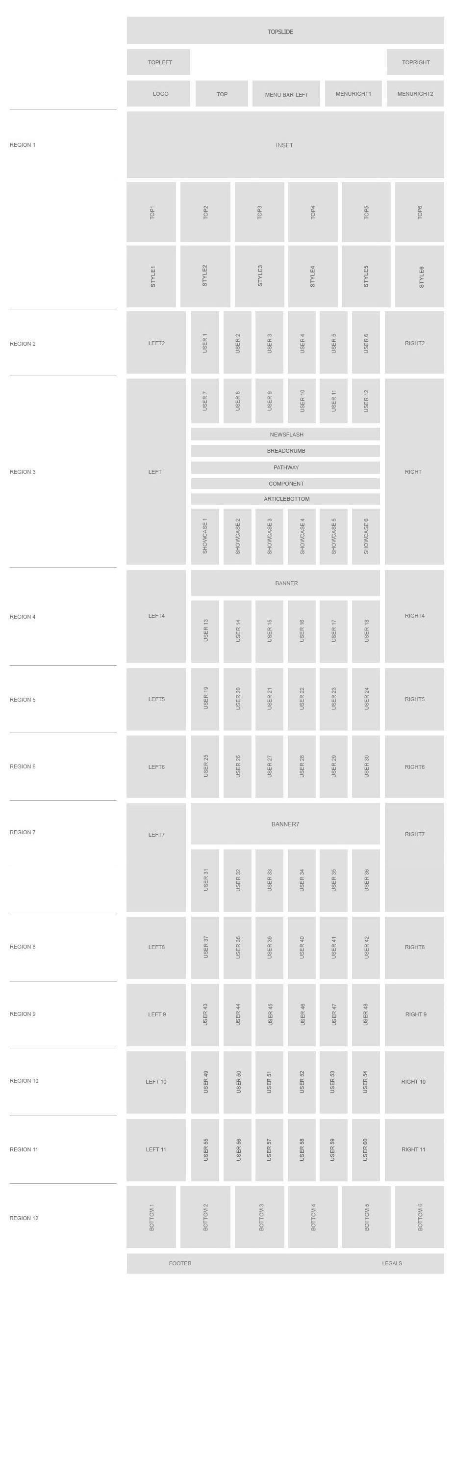
Template Features
Specifications:
- 4 Preset Styles
- 100+ Module Positions
- 60+ Stock Module Suffix Styles
- CSS3 Menu Styles
- Commented source files
- Browser Support for IE, Firefox, Opera, Safari and Chrome.
Advanced Features:
- XTC Template Framework
- Tableless Template Design
- Responsive Grid
- Bootstrapped Template
- Article Sidebars
- Mulitple Layout Options
- Custom Component Overides
Package Includes:
- JoomlaXTC Quickstart Installer
- JoomlaXTC Club Template
- JoomlaXTC Deluxe NewsPro
- JoomlaXTC Html Pro
- JoomlaXTC Image Gallery
- JoomlaXTC Quick YouTube
- ACYMailing Starter Edition
Extensions Included:
- Подробности
This template comes with 160+ module suffix styles.
Each suffix style can be used in conjunction with others : Simply use an space ' ' to bridge the suffix styles!
Font Awesome Icon Suffixes
Create Font Awesome Icons for your module title simply by adding the icon name to the module suffix class!
Font Awesome Icons
Web Application Icons
Accessibility Icons
Hand Icons
Transportation Icons
Gender Icons
File Type Icons
Spinner Icons
-
Note:
These icons work great with the
fa-spinclass. Check out the spinning icons example.
Form Control Icons
Payment Icons
Chart Icons
Currency Icons
Text Editor Icons
Directional Icons
Video Player Icons
Brand Icons
- All brand icons are trademarks of their respective owners.
- The use of these trademarks does not indicate endorsement of the trademark holder by Font Awesome, nor vice versa.
- Brand icons should only be used to represent the company or product to which they refer.
Medical Icons
Module Classes
- Подробности
- Категория: Uncategorised
Base Typography
Headings
All HTML headings, <h1> through <h6> are available.
h1. Heading 1
h2. Heading 2
h3. Heading 3
h4. Heading 4
h5. Heading 5
h6. Heading 6
DropCaps
ropcap Styling for article intros and much more. Lorem ipsum dolor sit amet, consectetuer adipiscing elit. Ut nunc lorem, eleifend vel, rhoncus sed, congue quis, leo. Aliquam dignissim dui quis purus. Phasellus vehicula, ante eu mollis pharetra, enim felis iaculis lacus, congue ullamcorper lorem eros at libero.
<div class="dropcap">D</div>ropcap Styling
Blockquotes
For quoting blocks of content from another source within your document.
Default blockquote
Wrap <blockquote> around any HTML as the quote. For straight quotes we recommend a <p>.
Lorem ipsum dolor sit amet, consectetur adipiscing elit. Integer posuere erat a ante.
<blockquote>
  <p>Lorem ipsum dolor sit amet, consectetur adipiscing elit. Integer posuere erat a ante.</p>
</blockquote>
Blockquote options
Style and content changes for simple variations on a standard blockquote.
Naming a source
Add <small> tag for identifying the source. Wrap the name of the source work in <cite>.
Lorem ipsum dolor sit amet, consectetur adipiscing elit. Integer posuere erat a ante.
Someone famous in Source Title
<blockquote>
  <p>Lorem ipsum dolor sit amet, consectetur adipiscing elit. Integer posuere erat a ante.</p>
  <small>Someone famous <cite title="Source Title">Source Title</cite></small>
</blockquote>
Alternate displays
Use .pull-right for a floated, right-aligned blockquote.
<blockquote class="pull-right">
  ...
</blockquote>
Addresses
795 Folsom Ave, Suite 600
San Francisco, CA 94107
P: (123) 456-7890Full Name
[email protected]
<address>
  <strong>Twitter, Inc.</strong><br>
  795 Folsom Ave, Suite 600<br>
  San Francisco, CA 94107<br>
  <abbr title="Phone">P:</abbr> (123) 456-7890
</address>

<address>
  <strong>Full Name</strong><br>
  <a href="mailto:#">[email protected]</a>
</address>
Quotes
Large Quotes
This is the large quote style using font awesome icons
<i class="fa fa-quote-left fa-5x"></i>This is the large quote style using font awesome icons<i class="fa fa-quote-right fa-5x"></i>
Medium Quotes
This is the medium quote style using font awesome icons
<i class="fa fa-quote-left fa-3x"></i>This is the medium quote style using font awesome icons<i class="fa fa-quote-right fa-3x"></i>
Small Quotes
This is the small quote style using font awesome icons
<i class="fa fa-quote-left"></i>This is the small quote style using font awesome icons<i class="fa fa-quote-right"></i>
Code
For displaying source code within your document.
Inline
Wrap inline snippets of code with <code>.
<section> should be wrapped as inline.For example, <code><section></code> should be wrapped as inline.
Basic block
Use <pre> for multiple lines of code. Be sure to escape any angle brackets in the code for proper rendering.
<p>Sample text here...</p>
<pre> <p>Sample text here...</p> </pre>
Heads up! Be sure to keep code within <pre> tags as close to the left as possible; it will render all tabs.
You may optionally add the .pre-scrollable class which will set a max-height of 350px and provide a y-axis scrollbar.
Emphasis classes
Convey meaning through color with a handful of emphasis utility classes.
Fusce dapibus, tellus ac cursus commodo, tortor mauris nibh.
Etiam porta sem malesuada magna mollis euismod.
Donec ullamcorper nulla non metus auctor fringilla.
Aenean eu leo quam. Pellentesque ornare sem lacinia quam venenatis.
Duis mollis, est non commodo luctus, nisi erat porttitor ligula.
<p class="muted">Fusce dapibus, tellus ac cursus commodo, tortor mauris nibh.</p>
<p class="text-warning">Etiam porta sem malesuada magna mollis euismod.</p>
<p class="text-error">Donec ullamcorper nulla non metus auctor fringilla.</p>
<p class="text-info">Aenean eu leo quam. Pellentesque ornare sem lacinia quam venenatis.</p>
<p class="text-success">Duis mollis, est non commodo luctus, nisi erat porttitor ligula.</p>
Tables
Default styles
For basic styling—light padding and only horizontal dividers—add the base class .table to any <table>.
| # | First Name | Last Name | Username |
|---|---|---|---|
| 1 | Mark | Otto | @mdo |
| 2 | Jacob | Thornton | @fat |
| 3 | Larry | the Bird |
<table class="table">
  …
</table>
Optional classes
Add any of the following classes to the .table base class.
.table-striped
Adds zebra-striping to any table row within the <tbody> via the :nth-child CSS selector (not available in IE7-8).
| # | First Name | Last Name | Username |
|---|---|---|---|
| 1 | Mark | Otto | @mdo |
| 2 | Jacob | Thornton | @fat |
| 3 | Larry | the Bird |
<table class="table table-striped">
  …
</table>
.table-bordered
Add borders and rounded corners to the table.
| # | First Name | Last Name | Username |
|---|---|---|---|
| 1 | Mark | Otto | @mdo |
| Mark | Otto | @getbootstrap | |
| 2 | Jacob | Thornton | @fat |
| 3 | Larry the Bird | ||
<table class="table table-bordered">
  …
</table>
.table-hover
Enable a hover state on table rows within a <tbody>.
| # | First Name | Last Name | Username |
|---|---|---|---|
| 1 | Mark | Otto | @mdo |
| 2 | Jacob | Thornton | @fat |
| 3 | Larry the Bird | ||
<table class="table table-hover">
  …
</table>
.table-condensed
Makes tables more compact by cutting cell padding in half.
| # | First Name | Last Name | Username |
|---|---|---|---|
| 1 | Mark | Otto | @mdo |
| 2 | Jacob | Thornton | @fat |
| 3 | Larry the Bird | ||
<table class="table table-condensed">
  …
</table>
Optional row classes
Use contextual classes to color table rows.
| Class | Description |
|---|---|
.success |
Indicates a successful or positive action. |
.error |
Indicates a dangerous or potentially negative action. |
.warning |
Indicates a warning that might need attention. |
.info |
Used as an alternative to the default styles. |
| # | Product | Payment Taken | Status |
|---|---|---|---|
| 1 | TB - Monthly | 01/04/2012 | Approved |
| 2 | TB - Monthly | 02/04/2012 | Declined |
| 3 | TB - Monthly | 03/04/2012 | Pending |
| 4 | TB - Monthly | 04/04/2012 | Call in to confirm |
...
  <tr class="success">
    <td>1</td>
    <td>TB - Monthly</td>
    <td>01/04/2012</td>
    <td>Approved</td>
  </tr>
...
Supported table markup
List of supported table HTML elements and how they should be used.
| Tag | Description |
|---|---|
<table> |
Wrapping element for displaying data in a tabular format |
<thead> |
Container element for table header rows (<tr>) to label table columns |
<tbody> |
Container element for table rows (<tr>) in the body of the table |
<tr> |
Container element for a set of table cells (<td> or <th>) that appears on a single row |
<td> |
Default table cell |
<th> |
Special table cell for column (or row, depending on scope and placement) labels |
<caption> |
Description or summary of what the table holds, especially useful for screen readers |
<table>
  <caption>...</caption>
  <thead>
    <tr>
      <th>...</th>
      <th>...</th>
    </tr>
  </thead>
  <tbody>
    <tr>
      <td>...</td>
      <td>...</td>
    </tr>
  </tbody>
</table>
Blog Div Styles
<div class="blog-red">blog-red</div>
<div class=">blog-blue">blog-blue</div>
<div class="blog-green">blog-green</div>
<div class="blog-cyan">blog-cyan</div>
<div class="blog-tan">blog-tan</div>
<div class="blog-yellow">blog-yellow</div>
<div class="blog-grey">blog-grey</div>
<div class="blog-pink">blog-pink</div>
Flat Button Styles
<button class="btnblue">Blue Button</button>
<button class="btnred">Red Button</button>
<button class="btngreen">Green Button</button>
<button class="btngrey">Grey Button</button>
<button class="btnyellow">Yellow Button</button>
<button class="btnorange">Orange Button</button>
<button class="btn basecolor_1">BaseColor 1</button>
<button class="btn basecolor_2">BaseColor 2</button>
<button class="btn basecolor_3">BaseColor 3</button>
<button class="btn basecolor_4">BaseColor 4</button>
<button class="btn basecolor_5">BaseColor 5</button>
Bootstrap Components
Accordion
<div class="accordion" id="accordion2">
  <div class="accordion-group">
    <div class="accordion-heading">
      <a class="accordion-toggle" data-toggle="collapse" data-parent="#accordion2" href="#collapseOne">
        Collapsible Group Item #1
      </a>
    </div>
    <div id="collapseOne" class="accordion-body collapse in">
      <div class="accordion-inner">
        Anim pariatur cliche...
      </div>
    </div>
  </div>
  <div class="accordion-group">
    <div class="accordion-heading">
      <a class="accordion-toggle" data-toggle="collapse" data-parent="#accordion2" href="#collapseTwo">
        Collapsible Group Item #2
      </a>
    </div>
    <div id="collapseTwo" class="accordion-body collapse">
      <div class="accordion-inner">
        Anim pariatur cliche...
      </div>
    </div>
  </div>
</div>
...
Carousel

First Item
Dolor donec sagittis sapien. Ante aptent feugiat adipisicing.

Second Item
Dolor donec sagittis sapien. Ante aptent feugiat adipisicing.

Third Item
Dolor donec sagittis sapien. Ante aptent feugiat adipisicing.
<div id="myCarousel" class="carousel slide">
<ol class="carousel-indicators">
<li data-target="#myCarousel" data-slide-to="0" class="active"></li>
<li data-target="#myCarousel" data-slide-to="1"></li>
<li data-target="#myCarousel" data-slide-to="2"></li>
</ol>
<!-- Carousel items -->
<div class="carousel-inner">
<div class="active item">…</div>
<div class="item">…</div>
<div class="item">…</div>
</div>
<!-- Carousel nav -->
<a class="carousel-control left" href="#myCarousel" data-slide="prev">‹</a>
<a class="carousel-control right" href="#myCarousel" data-slide="next">›</a>
</div>
Tabs
I'm in Section 1.
Howdy, I'm in Section 2.
Howdy, I'm in Section 3.
Howdy, I'm in Section 4.
<div class="tabbable"> <!-- Only required for left/right tabs -->
  <ul class="nav nav-tabs">
    <li class="active"><a href="#tab1" data-toggle="tab">Section 1</a></li>
    <li><a href="#tab2" data-toggle="tab">Section 2</a></li>
  </ul>
  <div class="tab-content">
    <div class="tab-pane active" id="tab1">
      <p>I'm in Section 1.</p>
    </div>
    <div class="tab-pane" id="tab2">
      <p>Howdy, I'm in Section 2.</p>
    </div>
  </div>
</div>
Fade in tabs
To make tabs fade in, add .fade to each .tab-pane.
Modal
Launch demo modal<!-- Button to trigger modal -->
<a href="#myModal" role="button" class="btn" data-toggle="modal">Launch demo modal</a>
<!-- Modal -->
<div id="myModal" class="modal hide fade" tabindex="-1" role="dialog" aria-labelledby="myModalLabel" aria-hidden="true">
<div class="modal-header">
<button type="button" class="close" data-dismiss="modal" aria-hidden="true">?</button>
<h3 id="myModalLabel">Modal header</h3>
</div>
<div class="modal-body">
<p>One fine body…</p>
</div>
<div class="modal-footer">
<button class="btn" data-dismiss="modal" aria-hidden="true">Close</button>
<button class="btn btn-primary">Save changes</button>
</div>
</div>
Progress Bars
<div class="progress progress-info">
  <div class="bar" style="width: 20%"></div>
</div>
<div class="progress progress-success">
  <div class="bar" style="width: 40%"></div>
</div>
<div class="progress progress-warning">
  <div class="bar" style="width: 60%"></div>
</div>
<div class="progress progress-danger">
  <div class="bar" style="width: 80%"></div>
</div>
Progress Bars Striped
<div class="progress progress-info progress-striped">
  <div class="bar" style="width: 20%"></div>
</div>
<div class="progress progress-success progress-striped">
  <div class="bar" style="width: 40%"></div>
</div>
<div class="progress progress-warning progress-striped">
  <div class="bar" style="width: 60%"></div>
</div>
<div class="progress progress-danger progress-striped">
  <div class="bar" style="width: 80%"></div>
</div>
Progress Bar Animated
<div class="progress progress-striped active">
  <div class="bar" style="width: 40%;"></div>
</div>
Progress Bars Stacked
<div class="progress">
  <div class="bar bar-success" style="width: 35%;"></div>
  <div class="bar bar-warning" style="width: 20%;"></div>
  <div class="bar bar-danger" style="width: 10%;"></div>
</div>
Font Awesome Icon Sets
Font Awesome Icons work with an i class and the icon name:
<i class="fa fa-users"></i>
Web Application Icons
Accessibility Icons
Hand Icons
Transportation Icons
Gender Icons
File Type Icons
Spinner Icons
-
Note:
These icons work great with the
fa-spinclass. Check out the spinning icons example.
Form Control Icons
Payment Icons
Chart Icons
Currency Icons
Text Editor Icons
Directional Icons
Video Player Icons
Brand Icons
- All brand icons are trademarks of their respective owners.
- The use of these trademarks does not indicate endorsement of the trademark holder by Font Awesome, nor vice versa.
- Brand icons should only be used to represent the company or product to which they refer.
Medical Icons